Project spotlight
HomeCloud: a calm place for shared life logistics
HomeCloud exists because “shared drives” tend to become junk drawers. This system is intentionally small: files, notes, shared utilities, and a few guardrails. It’s built to feel obvious to non-technical people, even on a rushed day.
Problem
- Important info scattered across texts, email threads, and random folders.
- No clear “source of truth” for documents or household reference stuff.
- Tools that are technically capable but emotionally exhausting to use.
Answer
- One place with simple roles (admin / family / guest).
- Left-nav that makes sense at a glance.
- Calm layout, consistent wording, minimal clicks.
What “calm system” means here
rules, not vibes
HomeCloud is not trying to be a platform. It’s trying to be dependable. Every feature has to justify its existence by reducing friction for real people.
Design
Readable first
Structure is the UI. Neon accents are guidance, not decoration.
Behavior
Status > ornament
If something is “loading” or “missing,” it should say so plainly.
Change
Evolves with use
It gets edited after real-world friction is observed, not guessed.
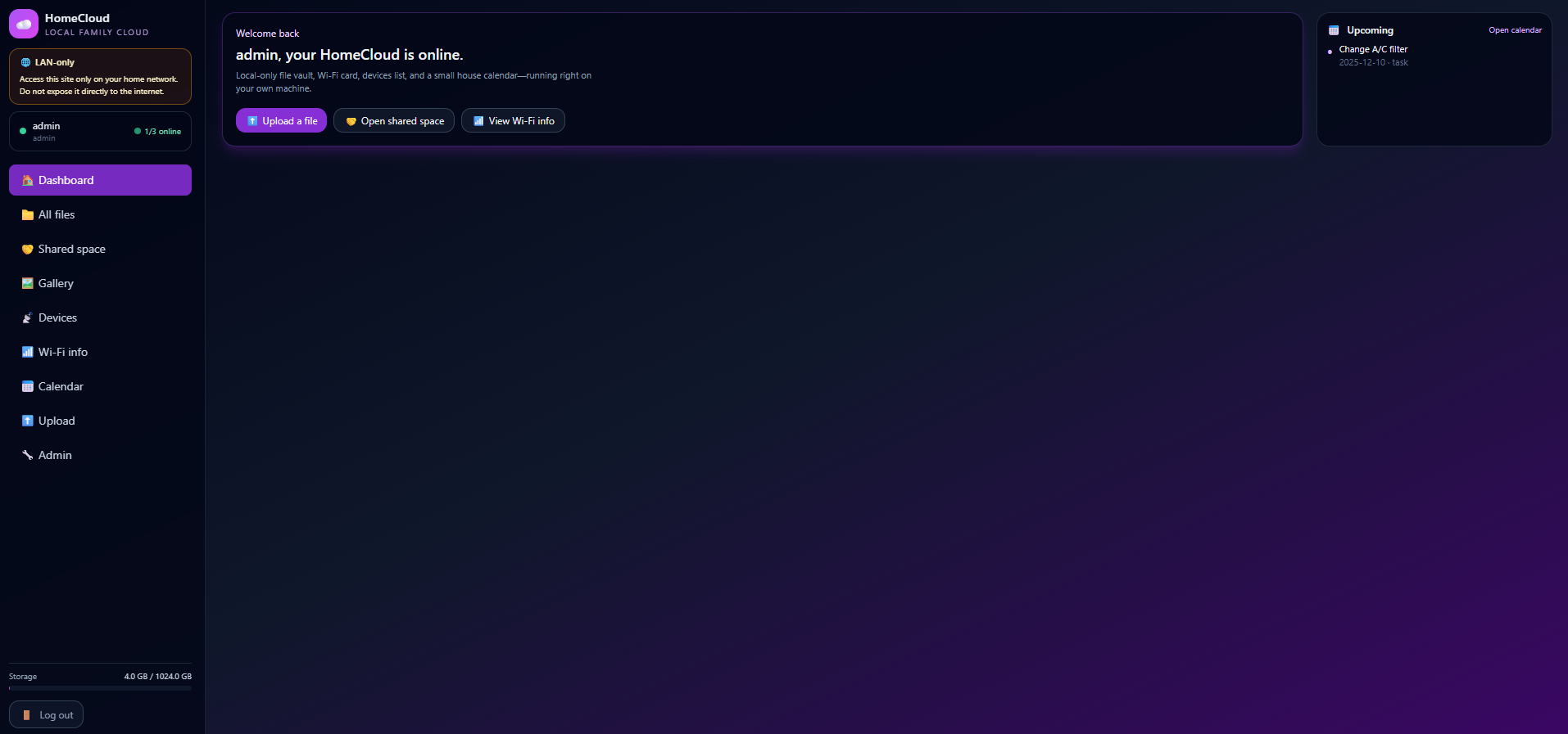
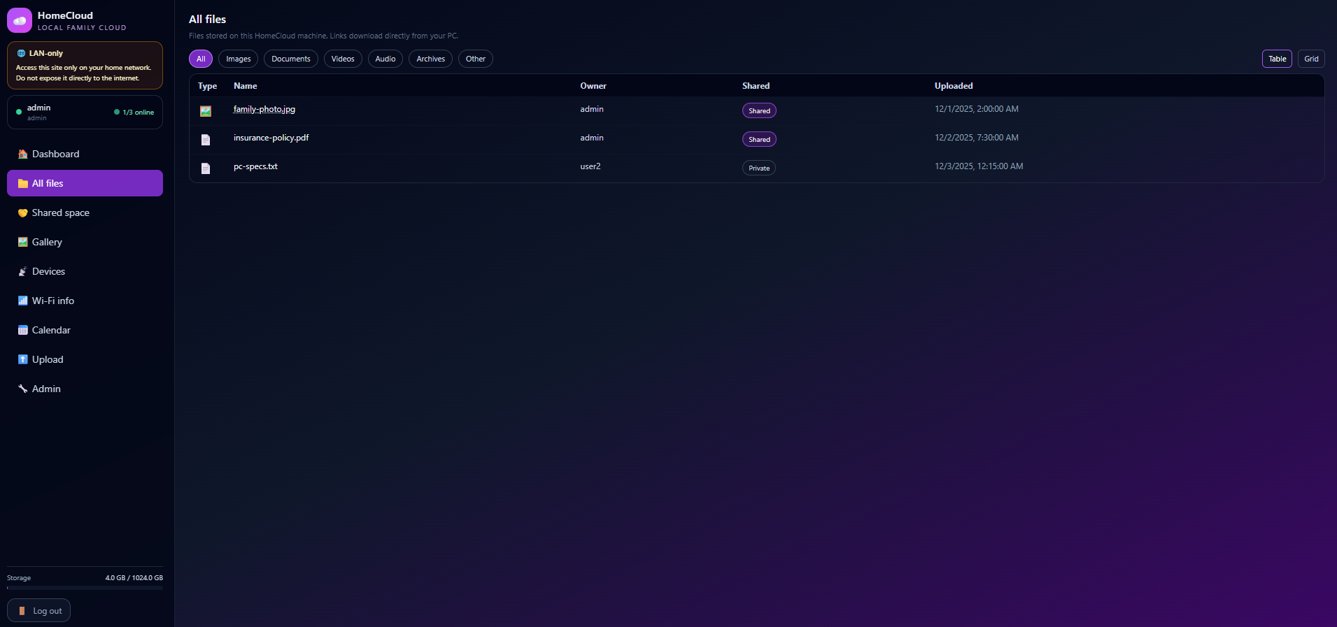
Screens
click to view
These are the current “shape” of the system. The screenshot viewer is shared across the site.
Build notes
how it stays small
- Static-first. Most pages should work without a server doing gymnastics.
- Lightweight state. Sessions are helpful; complicated auth flows are not.
- No buzzwords. The UX is allowed to be boring if it’s reliable.
- Operational tone. Wording should help someone take action.
© mikeford.org
HomeCloud spotlight · framework-free